I recently had a very novel experience running a game that I think has some potential that ought to be explored. Maybe someone out there has done this sort of thing and would like to share. It's a weird one.
Not too long ago, I was flattered to be asked by W.F. Smith (of Prismatic Wasteland fame) to do some playtesting for his upcoming crowd-funded adventure "zine," Barkeep on the Borderlands. The premise is simple: 200 years after the famous Keep on the Borderlands adventure from the TSR era of D&D, long after the Caves of Chaos have been cleared out by adventurers, the keep has grown into a large, bustling, cosmopolitan community. Its present-day culture and institutions of power are colored by the long history of consequences from that legendary adventure, and now your 21st-century players are invited to partake in one of the all-time great traditions celebrating that legend: six days of non-stop carousing in the Raves of Chaos. It's a barcrawl adventure with a hand-crafted town populated with lots of fun NPCs, factions, plot hooks, and 20 fully-detailed pubs.
I playtested it with three separate groups across 4 sessions, getting about 20 hours of experience running this adventure in total. I am happy to report that it was a great success, much fun was had, and valuable feedback was gained and incorporated. I recently gave high praise to one of Smith's previous, smaller adventures, and I myself originally backed the Kickstarter for Barkeep simply as a fan, not having yet really met him. Well before moving on to the main subject of this post, I'll go ahead and give a quick two thumbs up review. This adventure is dripping with that special sauce you want. I wasn't compensated in any way, save for the privilege of getting to play this adventure before anyone else on Earth. Here's a link to pre-order a copy.
Y'see, every pub has a two-page spread detailing its inhabitants, menu, gimmick, and some random encounter tables to roll on so wacky things could happen as the PCs spend time there. Except for a pub called "Our Lady of the Sacred Speakeasy," which is a fairly notable location in the setting. It's the headquarters of one of the most important and powerful factions, the Church of Chaos, who are also serving a law enforcement role for the duration of the festival. As I read the adventure, I kind of developed this sense that it could serve pretty well as the "main" pub, in as much as any adventuring party might need one.
But it didn't have all those details!
I mean, it had a few. A brief description and a random encounter table, but not half as much as every other pub got. Instead, it has an illustration. One far fancier than you'll find in most of the rest of the pubs. Behold!
 |
| Artist Credit: Sam Mameli AKA Skullboy. Please enhance this picture and spend some time browsing it in full-size. |
When my players arrived at this pub, I didn't have much detail to work from. But I was provided this image, so... I started running the scene straight off the illustration. Rather than merely flavor to inspire the right mood or idea, I treated this image as a canonically accurate description of what the players see around themselves as they entered the building. These are the NPCs around you, the activities they're engaged in, the room elements to draw your interest, etc. This is the "room key," it just doesn't have any words.
I think the "correct" way to use this is to selfishly keep the image to myself. It contains some hidden knowledge after all (e.g. the big church in the basement), but I can use it to inform my descriptions. Not just the room details and the NPCs, but even the activities the NPCs are engaged in. There are hooks in this picture, I tell you.
It's funny because reviewers actually talk a lot about including "practical visuals" in RPG products. But usually they mean things like diagrams, flowcharts, or a really well-rendered and readable map, with the key directly on it. I think everyone agrees that illustrations of characters, monsters, and hijinks are expected to just be flavor, right? But... if the best way to improve a map-based adventure is to put the map key directly next to (or within) the rooms on the illustration, then... what if you cut out the middle man and just draw the description?
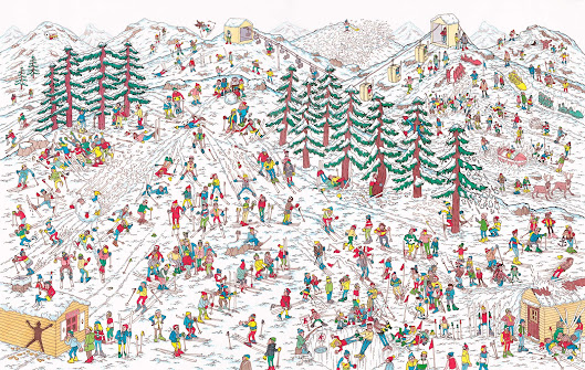
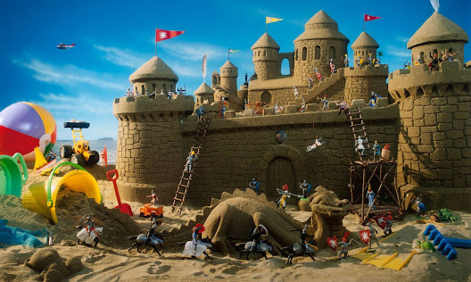
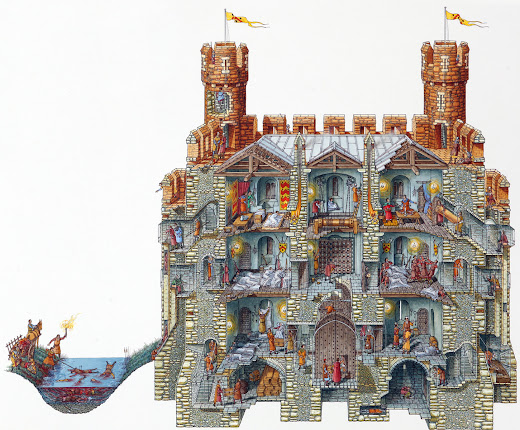
This image gave the same kind of vibes as a Where's Waldo book or an I Spy book from my childhood, or one of Stephen Biesty's famous Cross-Section drawings. The kinds of intensely detailed pictures that you can just pore over for hours and hours and always find new treats.
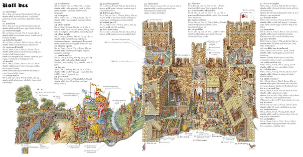 |
| Funnily enough, while I was looking for good examples to put in this post, I came across this tweet by Rise Up Comus. Small world. |
As a comic reader, I always liked big splash pages that indulged in this. It's often some of the best worldbuilding you can do in a visual medium.
 |
| From Jeff Smith's Bone |
Famous French artist Moebius was killer at these.
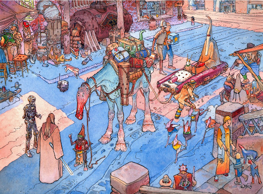 |
| Concept art he did for Star Wars Episode One: The Phantom Menace |
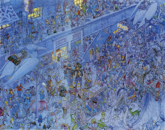 |
| A really intense example, entitled "City of Fire." |
Here's a great splash page from Chris McDowall's Electric Bastionland, illustrated by Alec Sorensen.
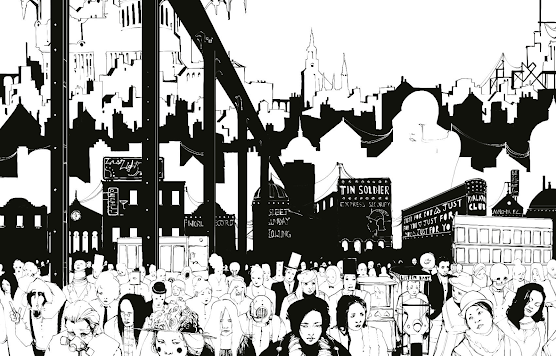 |
| (Thanks to Yochai Gal for pointing me to this example) |
Most of these examples seem best as visual NPC rosters. Of course we expect an NPC roster to have names and some info about the character's role, background, motivations, etc., which could even probably be written onto some of these pictures, but... you could probably go a long way just running your urban social encounters off of these drawings alone.
So you got dungeon maps, building maps, and NPC lists in visual form. What about larger scale maps? A dungeon must be "explored," unknown to the players going in and slowly mapped out as they go from room to room. But a city or country is usually pretty well-sketched out in the players' mind. They don't need to discover cool sites, they can just pick cool sites they already know about (although there's plenty of room for discovery too, obviously). So in that case, what better option than a rich and detailed illustration to put in their hands and let them peruse at their leisure?
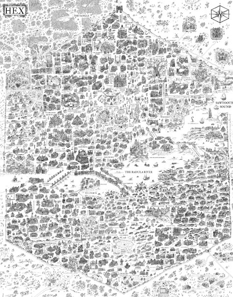
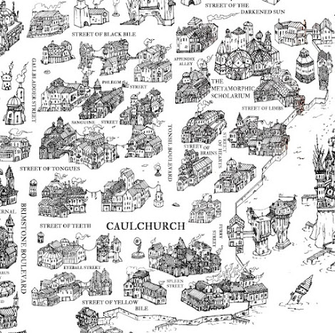
I'm reminded of a famous-ish OSR blog post by Bearded-Devil, called How I Run a Citycrawl Campaign. I highly recommend it, but for the impatient: he runs his whole game in a city called Hex, which he drew a map of in excruciating detail before beginning the campaign. The basic "procedure" he uses each session is to tell the players to explore the map, find a cool detail, and they "zoom in" on that part of Hex. Then he breaks out his notes on that area.
To illustrate, here's a frustratingly low-res image of Hex:
And here's an example of a zoomed-in area:
So, y'know, definitely a lot of work. But it seems amazing to me.
YouTuber Map Crow made a very relevant video recently that I think we can take a note from. He recommends that you should draw your big overworld maps with less meticulous and grounded cartography, like this...
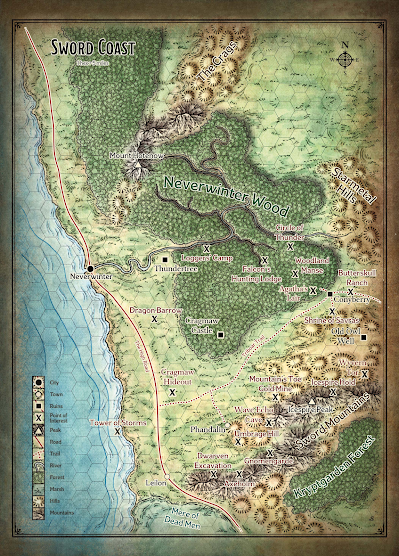 |
| Artist Credit: Mike Schley |
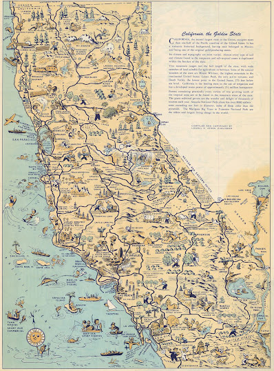
...and instead with a lot more juicy attractions that aren't necessarily proportionately sized, but which immediately communicate adventure-relevant info about a place. These are called Pictorial Maps if you want to look up more. I'm a fan of the subreddit r/PaperTowns for maps with a similar appeal.
 |
| Artist Credit: Gilbert Anthony Pownall, from the 1924 children's picture book Traveller's Joy A Device |
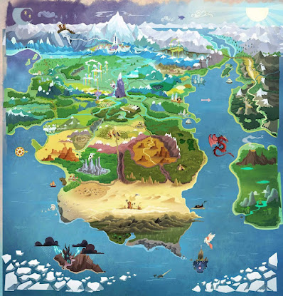 |
| The map of Equestria is better than 90% of the maps in RPG books. You could all stand to learn a thing or two from My Little Pony. |
 |
| Artist Credit: Some obscure cartographer I found from Namibia called Moiluyre. Wish I knew more because this is just such a splendid example. |
There are a lot of great video games that did this perfectly. Sometimes outside of the game...
 |
| Zelda II: The Adventure of Link |
...and sometimes within it.
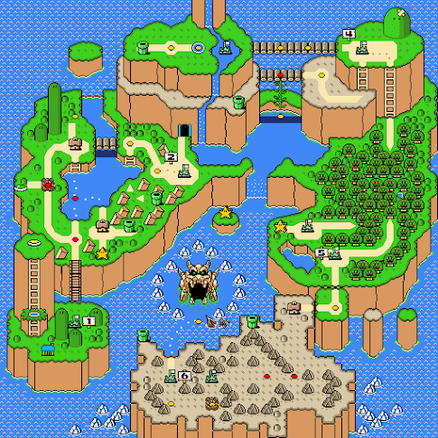 |
| Super Mario World |
I could totally run a campaign off of a map like this and I bet it would be rad as hell.
So that's maps down. What other kinds of densely-packed information do we ask of GMs and/or players to parse in play? Well, how about equipment lists? I have ranted many a time before on this blog how much I hate shopping sessions in D&D. I've committed instead to just making a comprehensive equipment list in my game that the players always have access to, so that they can simply browse on their own and inform me of their purchases when they're done (y'know, like how real shopping works).
But... I gotta admit that it sounds kinda fun to hand my players an I Spy image of a bunch of items on the shelves that they can point and ask questions about.
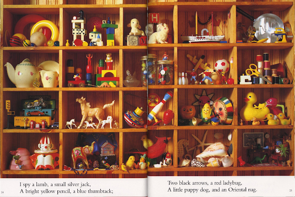 |
| Imagine something like this but with weapons, potions, charms, books, etc. |
I've always wanted to design my own GM screen, since the official ones never have the info that I personally need. And it always seemed obvious to me that I'd have to draw an illustration on the opposite side that my players could get totally lost in. They'll be staring at it all session, after all. Might as well make it interesting. But dare I ask: could we make it useful as well?
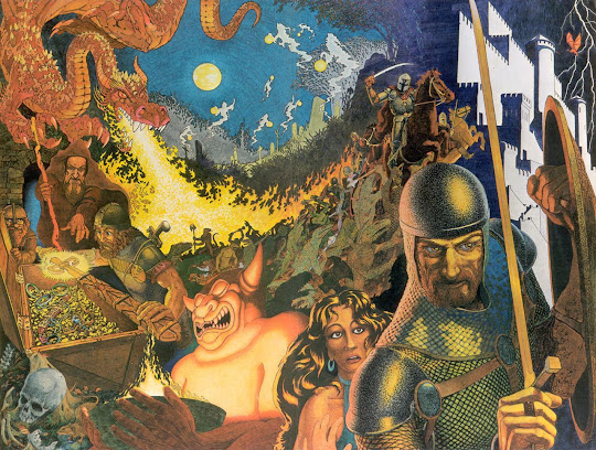 |
| Dave Trampier's famous DM screen has plenty of Easter eggs, sure. But can it be exploited by cunning players somehow? |
I still think that including text in your adventure products is ultimately necessary, but I'd be fascinated to see some efforts to prove that wrong. Something experimental that really pushes this concept to its limits and forces you to run the game in a totally new way.
-Dwiz


Imagine running a game using just the Torchbearer rpg GM's screen as the 'adventure'!
ReplyDeletehttps://s3.amazonaws.com/ksr/assets/002/081/499/10771323dc4e3bb78bdebd37ab25853f_large.jpg?1401559533
Love this post. The map section reminds me of the "one-page dungeon map" that was shared on this episode of Questing Beast: https://www.youtube.com/watch?v=LGmLcJHZLG8
ReplyDeleteAlso I wanted to share my personal favorite "densely detailed images:" https://i.pinimg.com/originals/4e/df/93/4edf93d4d8dbd489622bcf657900ca92.jpg
Here's another favorite from Berserk: https://static.wikia.nocookie.net/berserk/images/5/5f/J%C3%B6tunn.jpg/revision/latest?cb=20200520130947
ReplyDeleteI've always been hesitant to show my players illustrations, even those in modules we're playing. Obviously stuff that's important for reference like maps and puzzles are fine, but if it's just an image of an area or NPC, I would prefer them to each generate an image in their head free of outside influences. I find that establishing a definitive look for something tends to homogenize artists' interpretations and makes them a lot less interesting - compare, for example, the LotR art produced before the Jackson movies to those after.
ReplyDeleteThat being said, this is an interesting idea. At the very least, these sorts of illustrations are a rich vein of inspiration. And it has been used to some extent - the Tomb of Horrors does have handouts to show the players - but I suppose that's likely by virtue of it being a tournament module so it was important to ensure every group playing through it had the same idea of what they were dealing with.